05 / 2026
Webdesign & developmentLovable · In development
PROGRES ADVIES
A clear, considered digital home for leadership, change and inclusion.
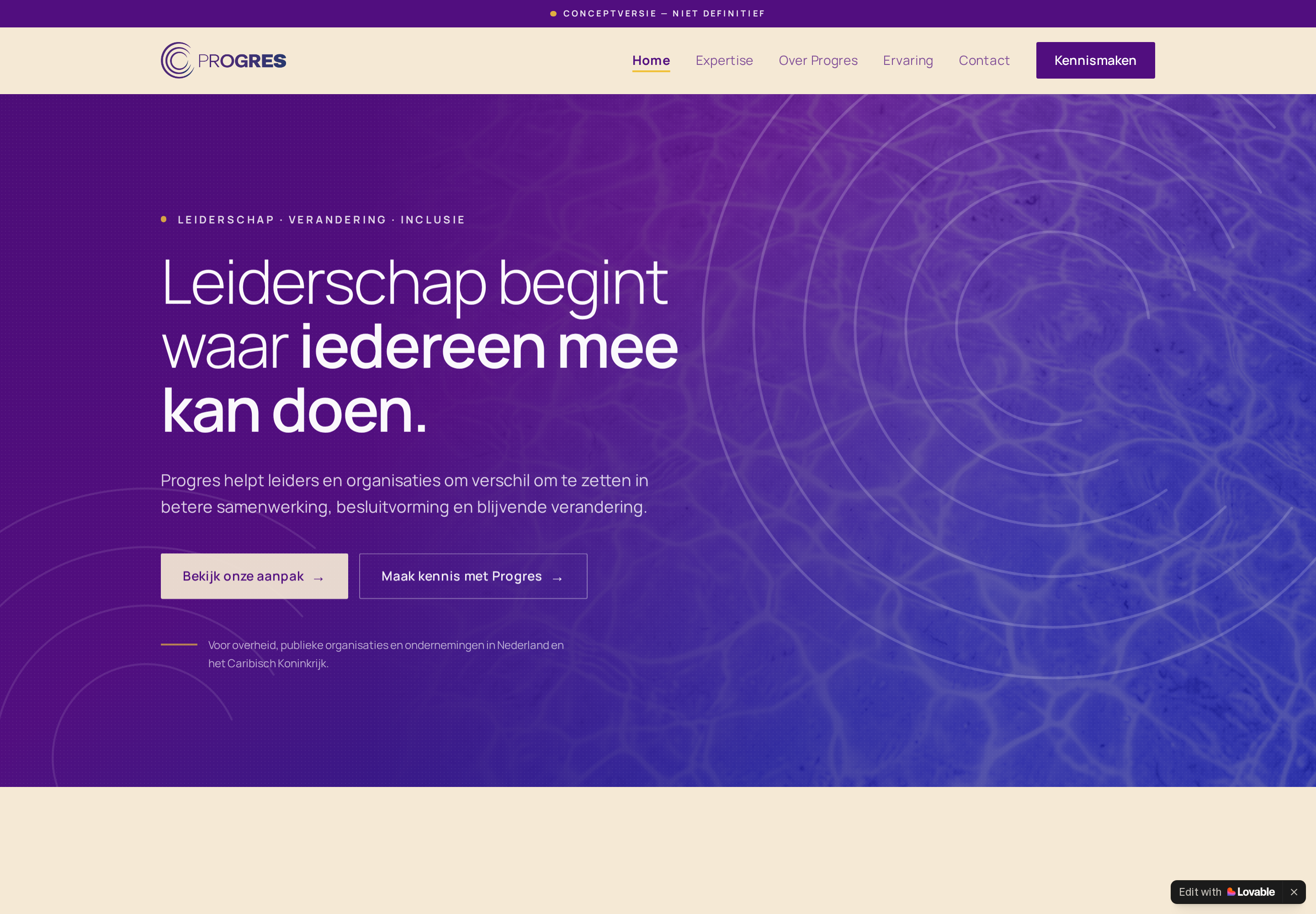
Shape a professional consultancy website for organisations in the Netherlands and the Caribbean, making Progres’ expertise easy to understand and the route to contact direct.
Readable typography, a focused service structure and a calm contact journey bring clarity to a layered subject. The current visual design is presented exactly as captured from the working site.
Webdesign / Development / UX / Content structure
THE CONTEXT
Professional consultancy for leadership, change and inclusion across the Netherlands and the Caribbean.
Leiderschap begint waar iedereen mee kan doen.
The site brings a layered consultancy offer into one readable starting point, without flattening the subject matter.DESKTOP EXPERIENCE
Actual working-site capture. The source project remains untouched and in development.
CONTENT ARCHITECTURE
The navigation separates expertise, studio context, experience and contact into direct routes.
Leiderschap
Leadership that makes participation possible and direction tangible.
Verandering
Change presented as a clear, navigable organisational practice.
Inclusie
Inclusion treated as part of how decisions and movement are built.
- 01Zien wat speelt
- 02Richting bepalen
- 03Beweging verankeren
MOBILE EXPERIENCE
The same hierarchy becomes a focused single-column contact journey at 390 pixels.
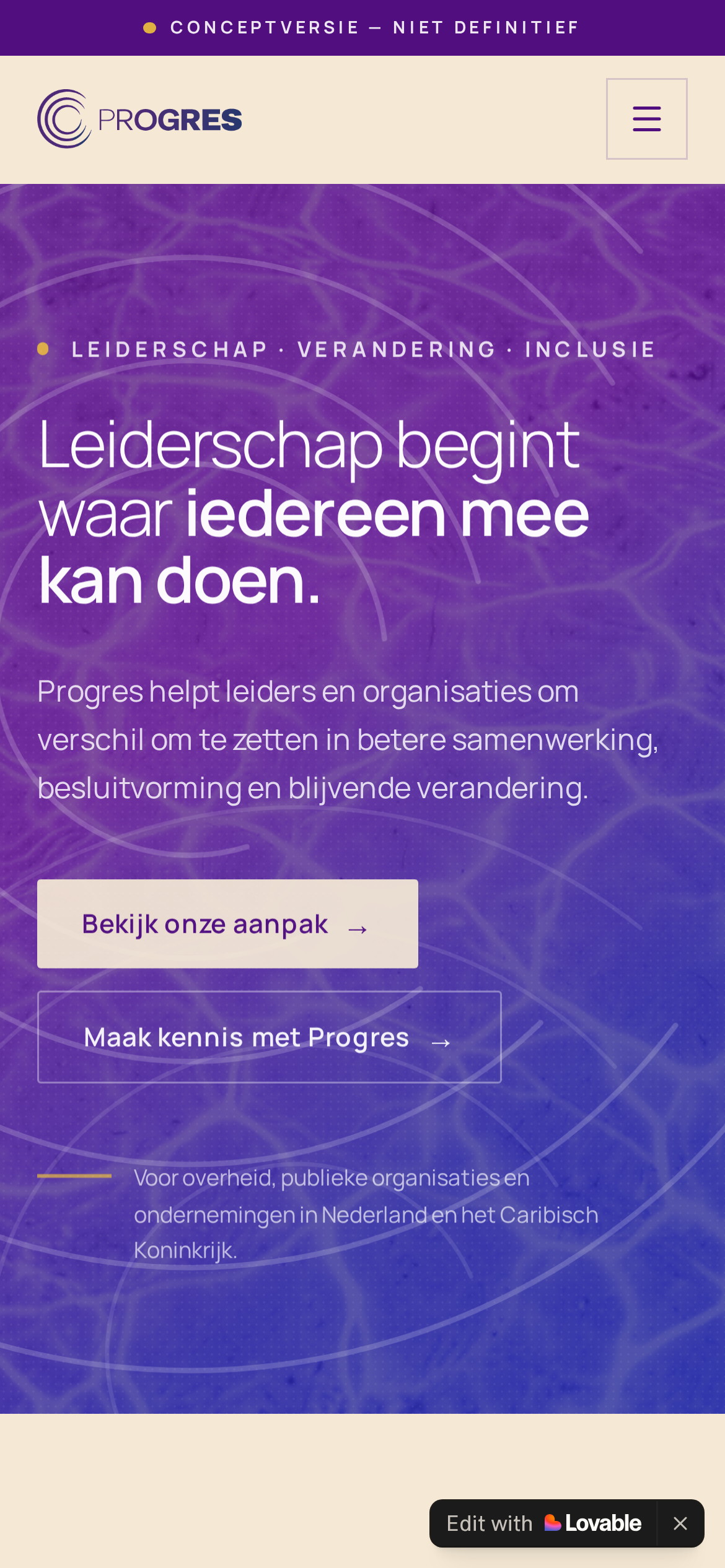
Generous type and short line lengths keep the core proposition clear over the expressive image field.
Expertise, Over Progres, Ervaring and Contact remain distinct destinations instead of competing on one page.
Primary and secondary actions stay visible together, letting visitors choose between the approach and direct introduction.
The opening copy names the Netherlands and the Caribbean without turning geography into decoration.