01 / 2026

Concept project

ODD HOURS

Breakfast after dark. A cereal identity for ideas that arrive late.
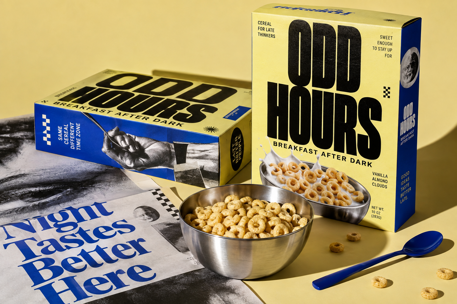
Odd Hours cereal identity across packaging, print and tableware
The brief

Make an everyday breakfast object feel native to midnight studios, unfinished thoughts and people who work outside the usual hours.

The decision

A loud condensed wordmark turns the box into a poster. Cobalt interrupts a warm yellow field, while monochrome editorial fragments make the system feel collected rather than polished away.

Scope

Positioning / Identity / Packaging / Art direction

01

THE PREMISE

Premise

A cereal for people whose day starts when everyone else’s ends. Breakfast is treated as a night-time ritual instead of a morning habit.

Audience

18–35 night shift workers, students, kitchen crews and studio people in city centres.

Tone of voice

Blunt, dry and awake. Never cute, never wellness, never nostalgic.

02

MARKS & LOCKUPS

Primary wordmark, endorsed lockup and a reduction mark for small applications.

ODD
HOURS
Primary wordmark: stacked, cropped to the trim on the right
ODD HOURSBREAKFAST AFTER DARK
Horizontal lockup with descriptor rule
OH02:00
Reduction mark for caps, jars and favicons
CEREAL
FOR NIGHT
PEOPLE
Certification stamp used once per surface
03

TYPOGRAPHY

Display

Condensed grotesque / 900 / −5.5% tracking / 0.79 line height / 80px and up

ODD HOURS

Statement

Bold grotesque / 800 / uppercase / 20–34px

BREAKFAST AFTER DARK

Detail

Regular / 500 / uppercase / 11px / +8% tracking

CEREAL FOR NIGHT PEOPLE / 340 G / SERVES 4

04

PALETTE

Signal Yellow#FFD400Dominant field: packaging front, poster groundApprox. 60% of the system
Night Cobalt#1B3BE0Interruption: one hard block or object per surfaceApprox. 25% of the system
Ink Black#0D0D0DAll display and detail typographyApprox. 12% of the system
Bowl Paper#EDE6D3Uncoated print stock and secondary packagingApprox. 3% of the system
05

MOTIF RULES

TASTE

The spoon is punctuation

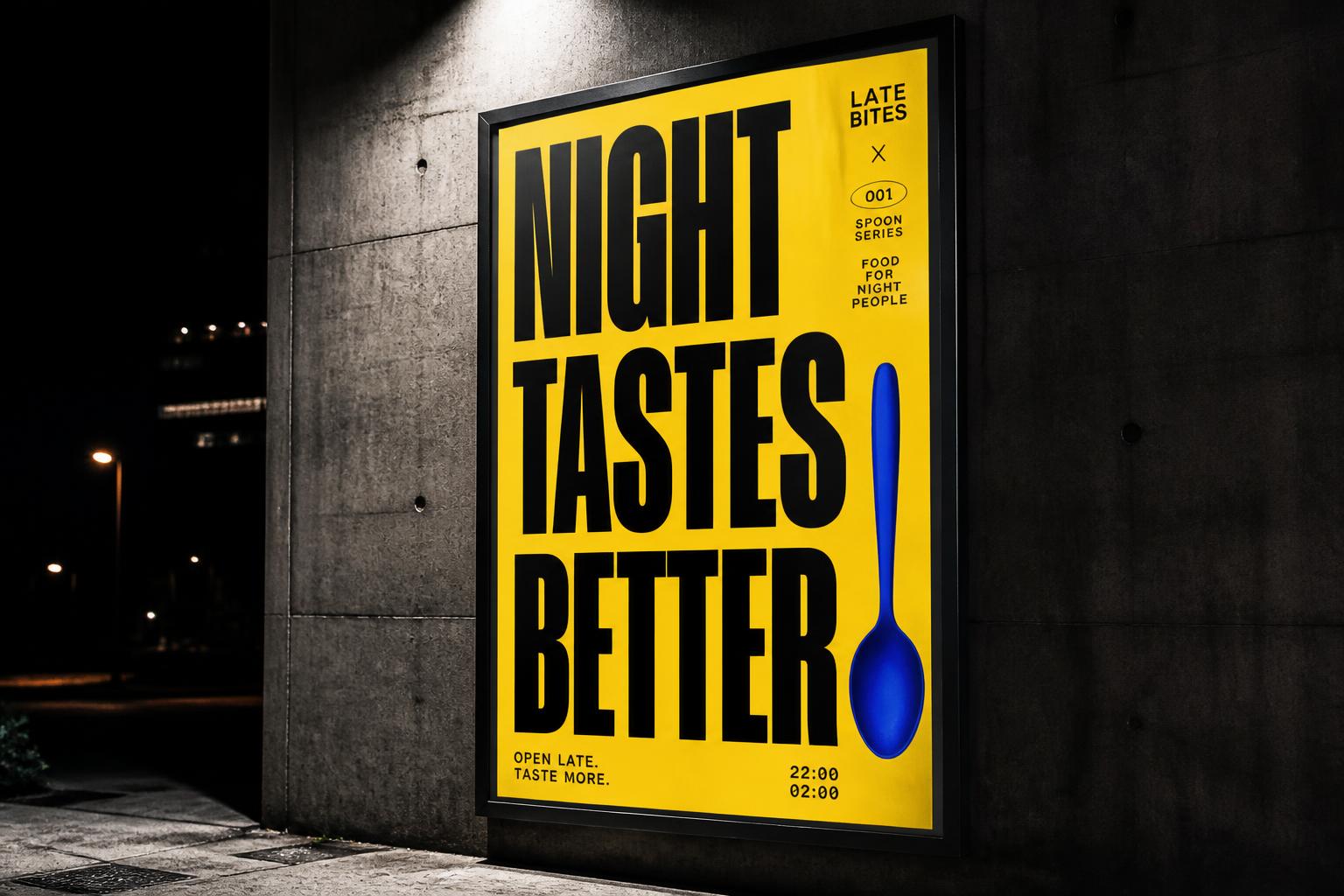
The cobalt spoon replaces a terminal mark or a letter stem. It never floats as decoration and never appears more than once per surface.

Cobalt interrupts, never surrounds

One hard-edged cobalt block cuts into the yellow field. No frames, no borders, no gradients.

HOURS

Type runs to the trim

Display type is cropped by at least one edge, so every surface reads as a fragment of something larger.

06

APPLICATIONS

Four surfaces, one system: shelf, range, street and feed.
Odd Hours identity across packaging, print and tableware
Identity overviewThe original art direction anchor: packaging, print fragments and tableware shot as one system.
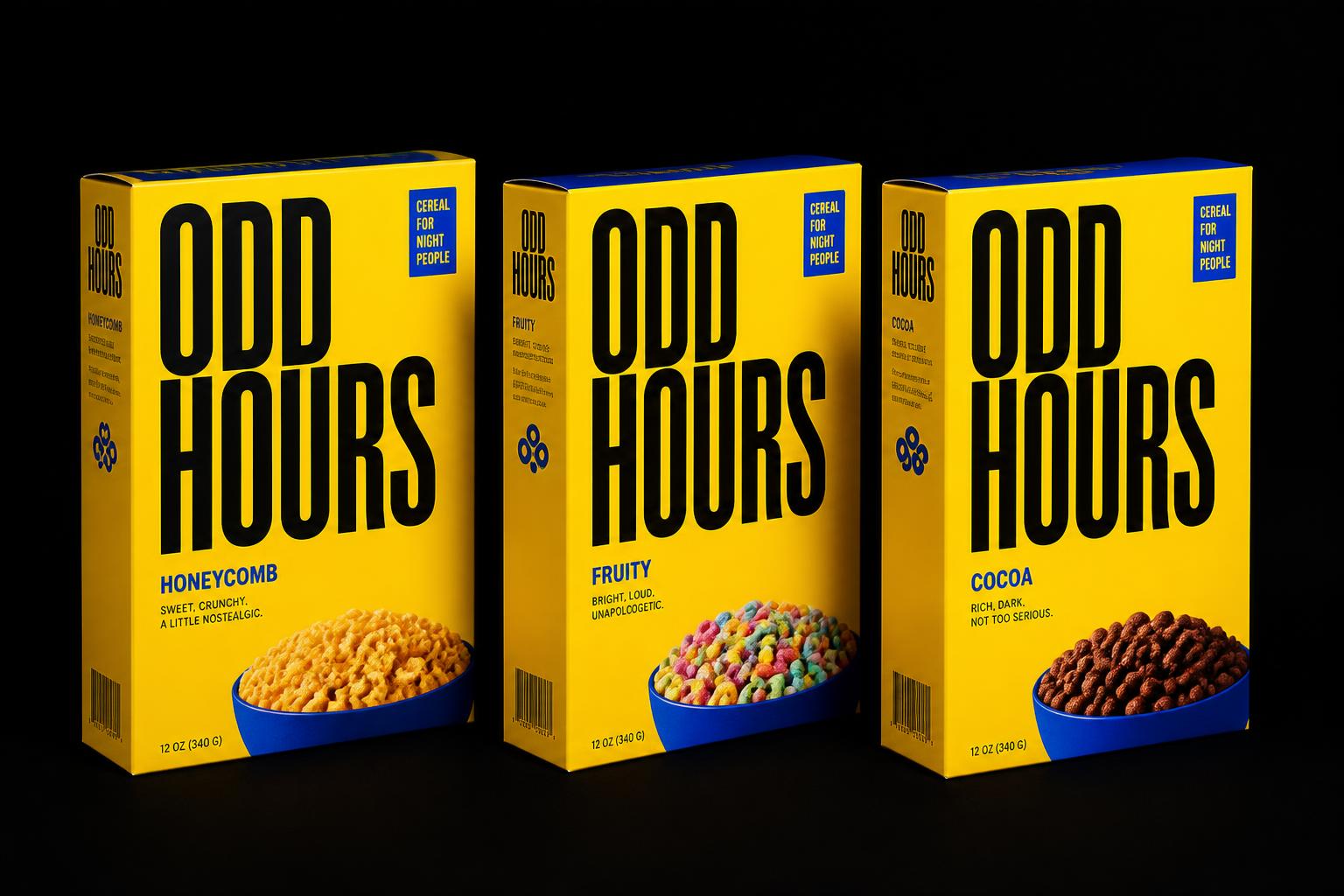
Three Odd Hours cereal boxes in yellow and cobalt on a black backdrop
Packaging rangeThree variants hold an identical display lockup; only the flavour line and cobalt block position change.
Yellow Odd Hours street poster at night reading Night Tastes Better
Street posterNight placement only. The spoon closes the headline instead of a full stop.
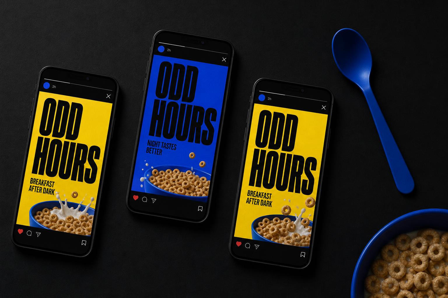
Three phone screens showing Odd Hours social posts
Social campaignVertical crops keep the wordmark running off-frame, so the feed reads as one continuous surface.