02 / 2026

Concept project

OFF SCRIPT

An independent film festival identity built to break the frame.
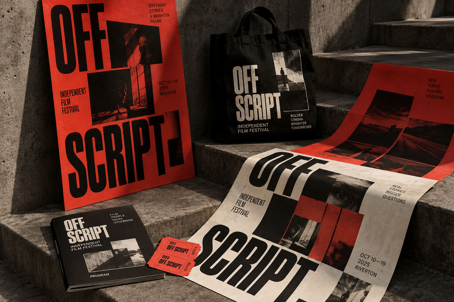
Off Script film festival identity on posters, programme and tickets
The brief

Create a festival system that gives unfamiliar voices the scale and urgency of a headline act without losing its independent edge.

The decision

Interrupted image frames and compressed typography create a visual edit in every application. A strict red, black and ivory palette keeps posters, tickets and programmes immediately connected.

Scope

Identity / Campaign / Print / Art direction

01

THE PREMISE

Premise

An independent film festival for work that never asked a studio for permission, programmed around risk rather than reputation.

Audience

City film audiences aged 20–45, programmers, press and first-time directors.

Tone of voice

Direct, unsentimental and slightly confrontational. Editorial, not promotional.

02

MARKS & LOCKUPS

A stacked festival mark, a single-line edition lockup and two functional marks.

OFF
SCRIPT
Primary mark: stacked, set at −5.5% tracking
OFF SCRIPTINDEPENDENT FILM FESTIVAL / EDITION 04
Edition lockup for programmes and press
OS
Frame mark: crop corners around the monogram
ADMIT
ONENO RED CARPET
Stub stamp used on tickets and door signage
03

TYPOGRAPHY

Display

Condensed grotesque / 900 / uppercase / −5.5% tracking / 0.75 line height

OFF SCRIPT

Programme

Regular / 400 / 16px / 1.45 line height / sentence case

Twelve features, four nights, no red carpet.

Data

Medium / 500 / uppercase / 10px / +10% tracking

ADMIT ONE / SCREEN 02 / 21:45

04

PALETTE

Cut Red#D8281FPrimary ground: posters, signage, ticket stubApprox. 58% of the system
Reel Black#0D0D0DDisplay type and inverted groundsApprox. 27% of the system
Festival Ivory#EAE0CEProgramme stock and reversed typeApprox. 14% of the system
Screen Grey#8C8C8CPhotography only, never as a flat colourApprox. 1% of the system
05

MOTIF RULES

Every image is interrupted

A horizontal band crops each frame on the same one-sixth grid, so the picture always reads as an edit rather than a still.

SCRIPT

Type crosses the picture

Display type overlaps the photograph. Captions never sit politely beneath an image.

Two colours per surface

Red with black, or red with ivory. Never all three as flat fields. Ivory returns only as paper stock.

06

APPLICATIONS

Poster series, festival print and the venue itself.
Off Script identity across posters, tote, programme and tickets
Identity overviewThe original art direction anchor: the full campaign photographed as one collected system.
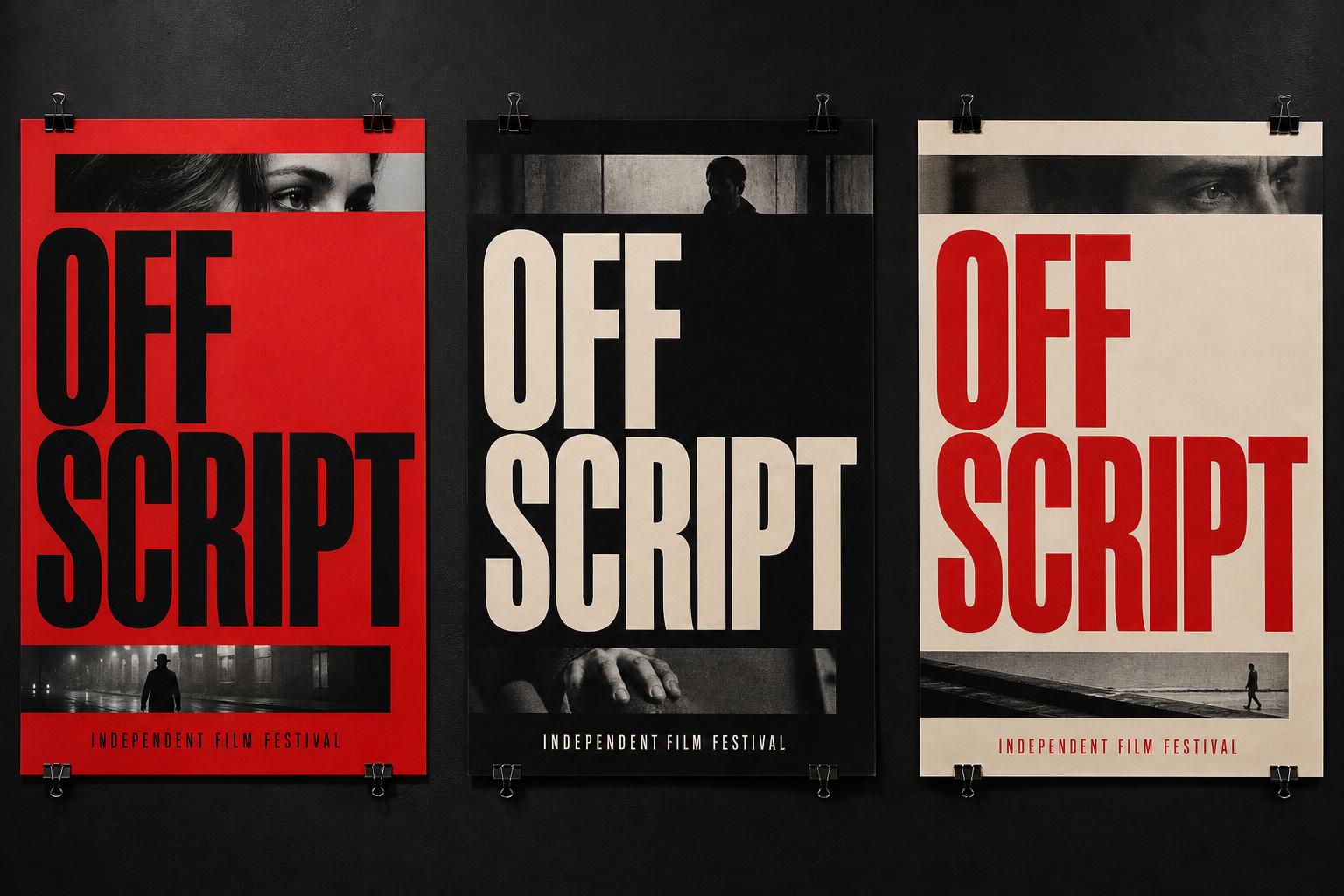
Three Off Script posters in red, black and ivory
Poster seriesThree grounds, one grid. Each poster crops a different frame on the same one-sixth band.
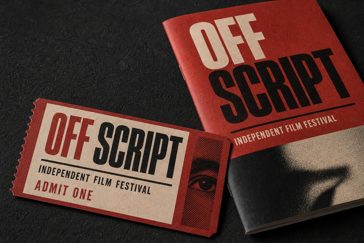
Off Script festival ticket and programme booklet
Ticket & programmeUncoated ivory stock, perforated stub and a halftone eye that repeats across the edition.
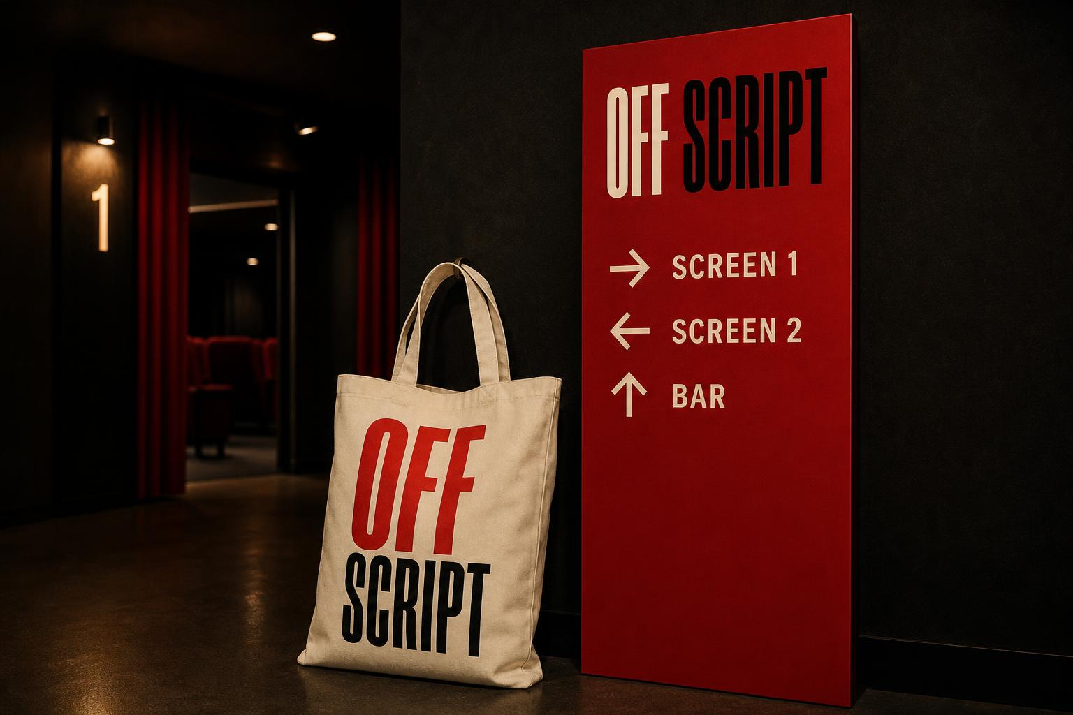
Off Script tote bag beside red foyer wayfinding signage
Tote & wayfindingIn the venue the system becomes navigation: red panels, ivory arrows, no decorative type.